Looking at Color Gradients
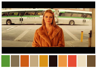
Hey blog. Since the last time I got back, we have made some changes to the film. We have been editing the film daily, throughout the week. We have done so much to the film so that it will match our ultimate theme of romance. We have decided to add a color gradient to the film to add a warm feeling to the atmosphere. We found that warm colors such as reds, oranges, and yellow add to the atmosphere. I even read online and according to some sources, these colors can evoke feelings of love. That may be the reasoning for why we chose it. We also tried out other colors. Some colors we tried were colors such as blue and purple, but they didn't do the trick like the warm colors did. I will say I am very happy about how Luke filmed our film. Luke filmed the shots very precisely, and is in my opinion his best work so far. I am really happy to see how he has progressed this year. His great film work has made the editing experience more enjoyable. However, Elton has one more thing to do and be will be doing it sometime this week. He still has to put in the "Directed by, and produced by". As you may recall title design is something, my group members and I paid a lot of attention too in the research leading up to filming. Elton has been looking for an effective way to embed these elements into our film. Elton has been putting it off hut he still has time to put this into our film but other factors have kept him from doing so. He has told the group he will make sure to get this in our film by the end of this week. Bye, blog!


.jpeg)
Comments
Post a Comment